The Gini is out of the bottle: Why Wall Street has nothing on inequality in the South
By Scott Edmonds, MDC
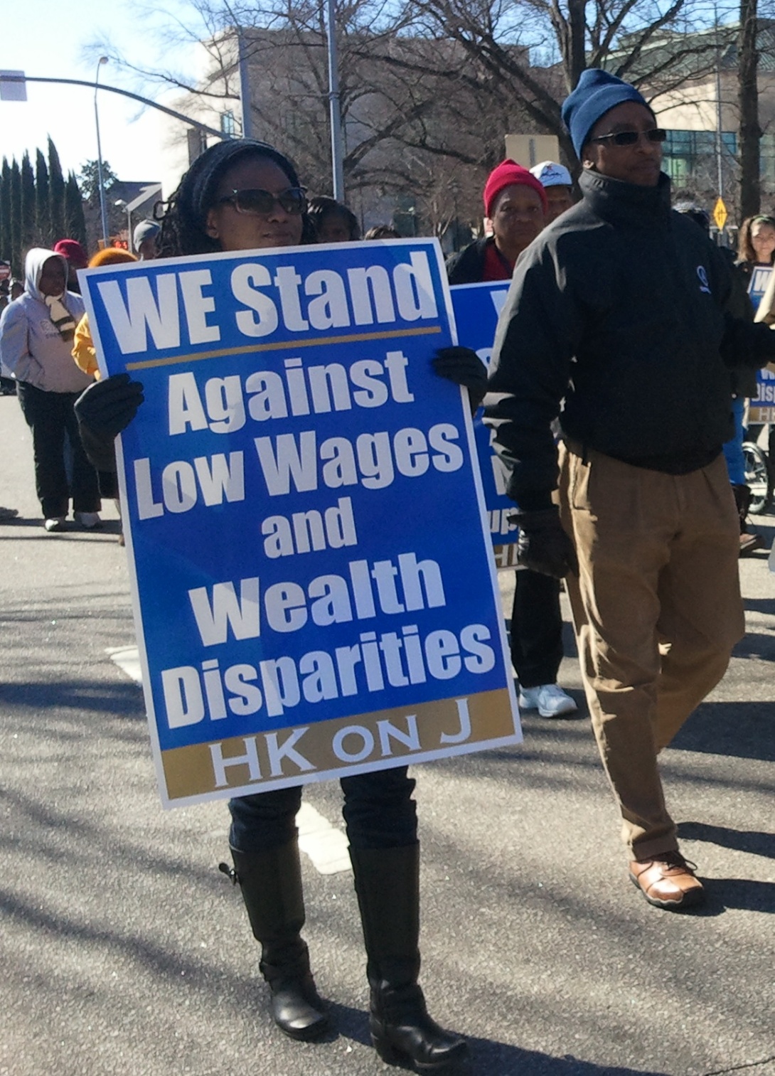
Regardless of how you measure it, the U.S. has witnessed a sharp climb in income inequality since the 1970s, with a new study finding that the wealth gap between the rich and the poor is as wide as it's been in 100 years. And while the demonstrations of Occupy Wall Street during the height of the financial crisis gave momentary voice to a growing concern about the impact of income inequality, you probably didn’t know that the geographic region with the most pervasive and entrenched income inequality is not in the epicenter of Wall Street (the greater New York area), but rather in the South.
Despite the South achieving significant strides in overall economic growth over the last several decades, the region as a whole still falls behind in key measures of overall poverty, educational attainment, and income inequality.
Consider a couple of facts on income inequality in the South:
• 14 of the Top 20, and 77 of the Top 100 counties with the highest inequality are located in the South
• The South as a region not only has the highest proportion of unequal counties, but is also home to the highest proportion of residents that reside in the nation’s most unequal counties
The commonly cited measure that reveals this significant regional disparity of income inequality is the Gini Index. The Gini coefficient runs from 0 to 1 (for the Gini Index, you simply multiply by 100). A value of "1" indicates perfect inequality, in which only one household has all the income. A value of "0" indicates perfect equality, where all households have equal income. The Gini Index is particularly useful because it can be used in an international context to evaluate differences between counties (as seen here and here), but more importantly it can now be used to compare differences within the U.S. for counties and metro areas -- an analysis that reveals some metro areas have inequality on par with many third-world counties.
The following map shows the county-by-county Gini Index scores, with the darkest areas representing counties with the highest rate of income inequality. [To see the full list of the top 20 most unequal Southern counties, look at the chart at the end of the post]. Stunningly, each of the Top 20 Southern counties with the highest inequality shares a Gini score higher than Bolivia.
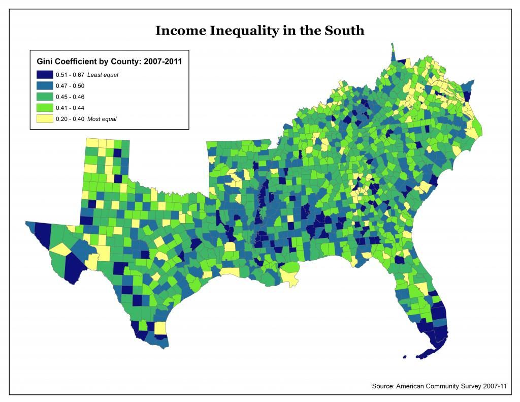
(For a larger version of the map, click here.)
While the Gini Index effectively distills the concept of income inequality to a single number for broad comparisons, it is not as useful in explaining the changes in income distribution over time, the distribution relative to actual household income (as seen when analyzing income quintiles – as provided by the Congressional Budget Office), the difference between wealth and income, or the effectiveness of our tax system and safety net in improving the lives of the less well off. However, one thing is clear: the South has a long way to go in advancing the economic mobility of people in poverty and closing the gap in income inequality.

(For a larger version of the chart, click here.)